Showing posts with label metallic. Show all posts

Wednesday, November 4, 2009

The Burkhardt House

Sorry, I’ve been lazy about keeping up with my blog.  I was gently reminded by several followers that I needed an update.  I WILL get better about updating more often.

Here is some work I did at a friend’s house.  Their oldest boy loves frogs.  We started with a green khaki base coat.  Then I added some little accents around the room.

In addition to painting the bedroom.  I’ve painted an accent wall at the end of the hallway.  P2210025 It’s a tissue paper texture with a colorwash.  It makes a great background for her mirror wall.

Tuesday, July 28, 2009

Vickie’s Nail Salon

First, let me apologize for my lack of posting these past few months.  I have been enjoying my time with the kids being out of school.  That being said, I haven’t made the time to be on the computer or work much for that matter.  I’m trying to get back into the groove.  Less than three weeks until school starts again.

These pictures are of a nail salon I had the pleasure of doing a couple years ago.  The owner, Vicki is a great person.  She is very involved in our community and a great inspiration to any businesswoman.  I met her several years ago and we instantly hit it off.  It amazes me the amount of things she can pack into each day. 

After many years of being on Main Street, Wauconda her business was becoming too large for the space.  Vicki built a new facility with lots more room.  It’s got separate areas for the spa, facials, hair and nails.
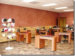
vickies manicure wall I gave the upper half of the walls a colorwash treatment in an eggplant color.  The lower half was textured and colored to give it a limestone finish.

This was my second time doing a commercial job.  I ran into some problems with the other contractors, that did the prep work and base coating.  The walls were to be primed and base coated prior to me starting.  Unfortunately, I found out the hard way that the walls weren’t actually primed before the base coat was applied.  After taping off the stones and applying the texture, I allowed it to dry.  When I started peeling the tape off, it was removing more than just the tape.  The paint and everything all the way down to the drywall was coming off.  It was a complete nightmare.  After several discussions with the contractors, we got confirmation that the walls were never primed.  This meant I had to patch the areas that were ruined and prime the walls again.  Oh yeah, and redo all the taping and stone work.  Once this was done the stones were colored to create the look of limestone.

vickie's pedicure wallspedicure area

The wall behind the chairs is bronze with a turquoise colorwash.  I love this color combination.

vickie's copper wallThis back wall has tissue paper for texture.  Then I applied copper paint and colorwashed with more turquoise.

It was a relief to finish this project given the problems I encountered along the way.  It was quite a learning experience for sure.  It goes to show why the prep work is one of the most important parts of the job. 

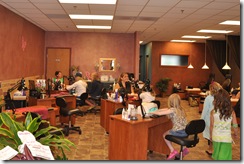
Vickie’s is a place I visit frequently.  It’s where my family goes for all our beauty needs.  We recently had the pleasure of celebrating my daughters’ 7th birthday there.  She invited five of her friends and I invited some of mine and together enjoyed some pampering.
DSC_0032

Friday, May 8, 2009

My Current Project

Here is the house I have been working on for the past couple of weeks.  The homeowners have been remodeling their house and had some faux finishing done.  They weren’t happy with the way their last faux finisher did the dining room.  They contacted me to redo it.  I redid the silver stripes and completely changed the ceiling.  The ceiling had a sponged look before that didn’t compliment the walls at all. Sorry, I didn’t get any before picture of this room.  Here is the completed room.  I can’t wait to see what it looks like with the furniture in it. DSC_0067DSC_0064

I also repainted their bathroom.  It had a venetian plaster type finish.  I think they were going for a marble look, that didn’t turn out quite right.  So, I repainted it with a bronze linen type look.   After several days, the husband decided he didn’t like this either.  It’s too close to the wood tones, so I’ll be lightening it.


I was also asked to change the living room.  It’s a green plaster, but too much green for the homeowners.  I troweled some of the gold I used for the dining room ceiling over the green.  This toned down the green and also helped the two rooms flow a little better.

DSC_0171

DSC_0173


The after picture didn’t photograph very good.  The gold was still wet and looks a lot more blotchy than it actually is.  It has more of a subtle marble look to it.  I’ll have to get another picture of it when I go back.

I am also doing the bedroom wall that they didn’t like.  The headboard wall had a cloud-like finish on the upper half.  I had suggested to do a colorblock technique and incorporate the two different blues, some silver, brown/bronze and white.  Well, I got it drawn out and started painting it.  To my surprise the next day I got a call and the husband thinks it’s too contemporary.DSC_0003 DSC_0004


I must admit, this one was a little disappointing.  I feel it really looked nice with their headboard and bedding.  Oh well, it’s back to the studio to come up with another idea.

Sometimes, these things happen.  It’s hard for some people to visualize what an entire wall is going to look like from just a small sample.  I enjoy the challenge and look forward to finding the perfect solution for this room.  I’ll post more when it gets finished.

Thursday, March 12, 2009

Sadie Wellington Salon

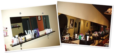
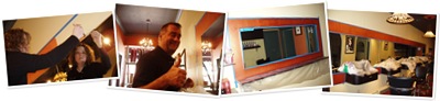
This is a salon I recently did some work in.  It has a very warm feeling when you walk into it.  One wall is exposed brick.  I just love the feeling exposed brick adds to a space.  They requested that I frame in the mirrors to bring some warmth to that side of the room.                                             

Before pictures of the two mirrors.  The larger mirror is 30ft. long and the smaller one is 5ft. long.

Here we are in action, applying the copper base for our faux finish.

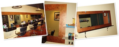
Finally, here is the finished product.  After removing the tape, I stepped back to inspect the job.  I must say, this was the first time I ever got the feeling that the finish product had always been there.  It fits in so perfectly to the space and really frames the mirrors nicely.

These before and after pictures sure show how a faux finish can transform a space into something wonderful. 

If you are ever in the area, check of this salon.  Sadie Wellington Salon is located in Barrington, Illinois.   For more information about them, check out their website http://www.swsalon.com.

Tuesday, January 20, 2009

Foil sample boards...

The kids are back to school after their five day weekend. They got two days off because school was cancelled due to extreme cold and Monday off for Martin Luther King Day. Now that they are in school, I've got a chance to post my samples I made using my foils.


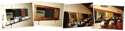
These first two are for a frame design to go around a 30' long mirror at a Salon I'm bidding on. They are very similar, the only difference is the second one doesn't have a color wash over the gold foiled design. The base is a copper metallic paint. Then I added some Van dyke brown, turquoise and gold.

I'm not a photographer and it's hard to get a good picture of anything metallic... at least for me.


This next one is my first attempt at matching our inspiration piece from 2008 Salon. I did this without my picture of the original with me. I can see now that there is more black showing than the original had and I need to add more of the magenta and blue to it. Back to the studio to work on this one. I also want to give the drip lines a little more color, so they don't look so washed out. Yep, the drips are part of the design. This has a black base with gold foil over it. Then a magenta and blue colorwash. Finally, the drips are added. This one gets messy, thank goodness for dropcloths. I like how this one is looking!

This last one isn't photographing the way I'd like it too. It looks pretty cool in person. It has an off white base coat. Next, I applied the clear halographic foil. I cut/tore the foil and placed it in sections, letting some pieces overlap to create more depth and interest. Finally, I added a turquise colorwash over the entire thing. I think this would be a cool look in a small bathroom (Joyce, your bathroom off the front door comes to mind). It would also look pretty cool on a ceiling.

Actually, I think I'm going to add some of the clear halographic foil to my basement ceiling. It has a stone texture to it and this will add a little umph (is that a word) to it, yet be subtle. It really looks cool when the light hits it, rainbow colors. Pictures of that will be coming soon.

Until next time....